
From the Art Life: Painting by the Season: Color Mixing: Quinacridone Gold PO 48 and Quinacridone Burnt Orange (Acrylic)
I'm sharing a recent post from The Art Life: Painting by the Season Workshop. This is information shared in one of our recent salons. I filmed the segment for the workshop and decided to share it here with you. (Big thanks to my Art Life students!)
If you haven't heard the news, PO 48 (the pigment used in Quinacridone Gold) has gone the way of PO 49 (the original Quin Gold pigment.) Before you panic or even worse, panic buy, I'm sharing some information about it here that may help you:
Watch the video here: https://youtu.be/lCeCcwlhUC0
Supplies used: card stock, palette (non porous surface), palette knife for mixing, pencil for notes, paper towels/rags for cleaning your knife, scrap paper for using up leftover paint
Note: For color mixing, I use small piles of colors to experiment with. The more you learn to mix your own colors, the more confidence you will gain and you WILL be able to do this again.
Some tips:
1. Keep your palette knife clean.
2. Take notes in the way that helps YOU to understand and remember.
3. Think about keeping a color reference journal, or color deck of cards. Anything that will help you learn to mix colors.
4. Remember, there's no such thing as mud, only neutral colors. Neutral colors will bring your work to life.
5. Spend time on a regular basis mixing colors.
6. Try to use colors with single (or limited) pigments as much as possible. Single/limited pigments make color mixing easier.
7. Use scrap paper to swatch colors and/or to use up leftover paint.
8. Stop looking at the names of the paints and look for the pigment numbers. The reason Paynes Grey from Golden looks different than Holbein is because the manufacturers use different pigments! You don't have to memorize the numbers. You just need to be aware and pay attention to the pigments vs the color names!
9. Try to work with a limited palette. You truly only need a limited amount of colors to be able to make every color of the rainbow.
10. Swatch out the original colors you are mixing on your page in addition to the mixes.
11. Use your knife to really mix the paint.
12. Craft paints have more filler and binder and less pigment. They can make it more difficult to produce cleaner color mixes.
13. Don't fret over the loss of PO 48. It happened seventeen years ago with PO 49 and the companies replaced it. Learning to mix your own colors will help you.
14. Blame the automotive industry. They're the ones responsible for the disappearance of these pigments/colors. Most paint colors are mixed for the demand of the automotive industry. Artists get the leftovers. ;)
I wanted to experiment with using colors that I had on hand before I went and bought colors I did not own to see what mixtures I could come up with.
Colors used:
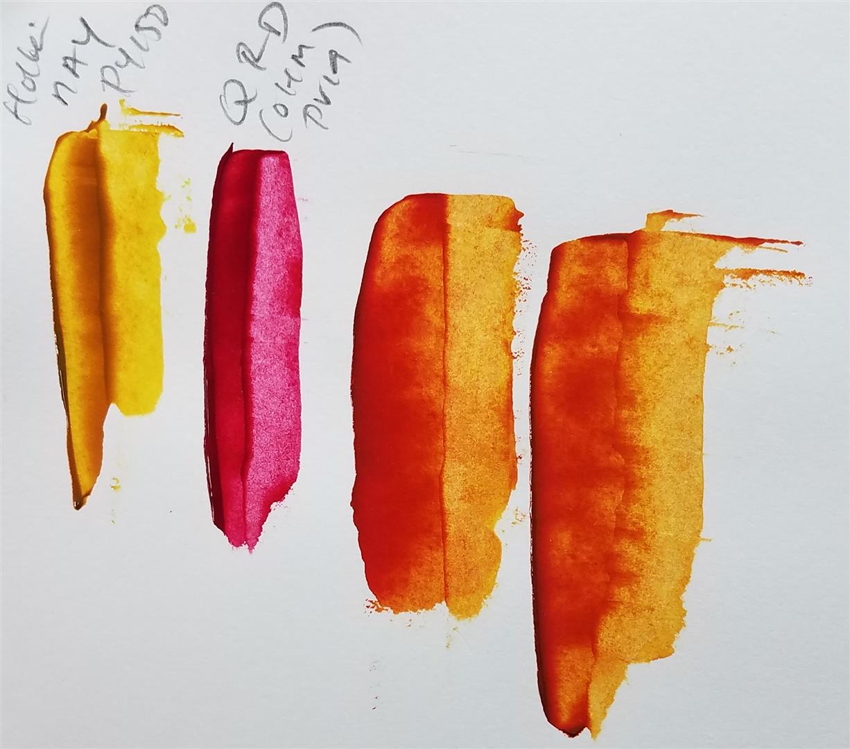
Holbein Quinacridone Gold PO 48 and PY 150
Time stamps: 0-2 minutes: supply list 2:31-4:26
Swatching out first mix including Holbein Quinacridone Gold, explaining mass tone and undertone.
(Masstone is the thick and opaque color, as you see it in the tube. Undertone is when the color is scraped out which allows you to see the true color.)


Mixture 1: 4:26-11:20
Holbein Greenish Yellow PY 129 AND PY 154
with
Holbein Quinacridone Magenta PR 122 (produces a similar mass tone)

Mixture 2: 11:30-16:08
Holbein Quinacridone Magenta PR 122
with
Utrecht Artist's Acrylic Colors Burnt Sienna PR 101

Mixture 3: 16:09-20:30
Sennelier Transparent Red Iron Oxide PR 101, PY 42 AND PR 102
with
Holbein Nickel Azo Yellow PY 150

Mixture 4: 20:31-25:16
Holbein Nickel Azo Yellow PY 150
with
Old Holland New Master's Classic Acrylics Quinacridone Rose Deep PV 19
Please let me know if you discover any alternatives! Or if you have any suggestions.
Thanks for watching!

Comments